Branding Your Work
Whether you’re a professional or amateur photographer, you should consider what your “brand” is all about. How do you want your audience to view you and your work? What image are you trying to project? Think hard about this branding stuff because it is critical for your success.
My assistant and I have long discussions (and arguments) when it comes to branding our work. Both of us are perfectionists when it comes to how my images look. But what I think largely sets us apart from our competition is that we give the same attention to how we present our work as I do in capturing every image.
I readily admit that I am blessed with an assistant as smart, diligent and experienced as Bob (Boyer). The fact that we both care about our “brand” is a bonus. If there is a flaw in one of our images, it does not leave our studio. Period.
But branding goes much farther than that for us. We are a high-end photographic business. I do editorial photography, but my work also hangs in major hospitals, offices, private homes and, occasionally, galleries. I want to be sure that everything that showcases my work is as thoughtfully done as the images themselves. We agonize over traditional framing options. Our face-mounted plexi images use nothing but the very best green-edged treatments and we add an architectural element to the mounting. We custom print our wall coverings ourselves in our shop so that they meet our exacting standards.
Crazy Branding
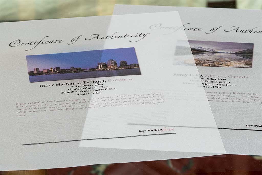
One recent example of how crazy this branding can get involves a gallery show that we did a few months ago, for which we printed several of my Limited Edition prints. These 30" x 40" prints, whether framed for unframed, are a significant investment, so we had long discussions over a seemingly petty thing like the Certificate of Authenticity (COA) that is transferred to the collector with the sale.Most photographers have fairly large print runs for their Limited Edition images, perhaps 50, 100 or more and there is nothing wrong with that business model. For our part, we only do print runs of 10 or 25 (inclusive of all sizes). We believe that adds value to my art images, which are printed on Moab archival art papers in our studio, using our Canon large format printers. So, these luscious prints are made to last 100 or more years.
Most COAs- and I have to be blunt here- look like they were created by 5th graders. Busy photographers simply pluck them off the Internet, maybe tinker with it a bit to personalize it, and then print it out and sign it. That flew in the face of our branding. We wanted our COA to perfectly match the high-end nature of our Limited Editions.
We went into design mode and over a period of two weeks we fidgeted and fussed until we had achieved what we were looking for. Our COA is not only “smart-looking” (a client’s words), but functional. It has three different security features that truly guarantee authenticity and would be very hard to forge (although no one in his right mind would attempt to forge my crappy signature!).
Our COA is printed on top-end vellum paper. It includes a matching image, a description of the image and a brief on the paper and ink. The number of prints in the series is lightly screened across the bottom of the page. Our company logo is printed in two colors, and on the reverse side is a black security stripe that indicates the number of the print in the series. The final touch is a security holographic stamp over which I sign my name.
Over the top? Perhaps. But then again, that is what we want our clients to experience with each of our products. That’s our brand.